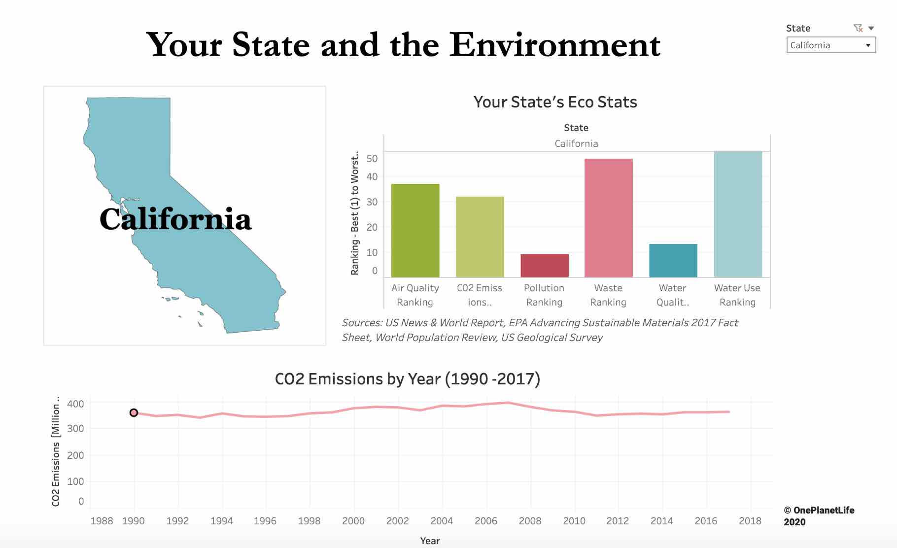
Last summer, we debuted the first addition to our Your State and the Environment dashboard with the State Report Card. In it, we brought together data from several high-quality sources to create comparative graphs of the ranking of each state in six environmental areas: air quality, CO2 emissions, pollution, waste, water quality, and water usage. Using our graphs, at a glance, the areas of greatest concern in your state are clear. Intrigued by this insight, you may find yourself wanting to understand more. Today, we are going to delve into the data to understand the measures used and what they mean for your state’s effect on the environment.
OPL gathers and analyzes research and data from the most trusted sources and shares it with you in clear, easy to understand Insights
Let’s start with AIR QUALITY.
Our air quality ranking is based on Air Quality Index Data, which comes from the Environmental Protection Agency (EPA). The index measures the levels of five major pollutants in the air: ground-level ozone, particle pollution (also known as particulate matter), carbon monoxide, sulfur dioxide, and nitrogen dioxide, and each pollutant has a standard set by the EPA to protect public health.
The index is measured on a scale of 0 to 500 and is broken up into six categories that correspond to the level of health concern – the lower the number, the better the air quality and fewer pollutants in your state’s air, with the satisfactory results being a score of 100 or less. To put things in perspective, the state with the worst air quality, Utah, has a ranking of 51.2, so it still falls well into the moderate category.
What factors can cause the ranking to drift up? A lot of things, it turns out. From the nitrogen oxides in tailpipe emissions to air pollution generated by coal-fired power plants that get carried by the wind to even mountainous topography that can cause pollution build-up.
Tracking CO2 EMISSIONS.
The data for the CO2 emissions ranking comes from the EPA’s Emissions & Generation Resource Integrated Database (eGRID), which is a comprehensive inventory of environmental attributes of electric power systems. For every power plant in the United States, eGRID records a detailed emissions profile, including carbon dioxide, nitrogen oxides, sulfur dioxide, methane, nitrous oxide, and mercury, and are then aggregated at the state and national levels. Our ranking looks at the state level.
Our pollution ranking is based on outdoor air pollution, which is responsible for 3.4 million deaths each year globally, more than eight times the number of homicides annually. Outdoor air pollution consists of two key pollutants: ozone and particulate matter. Ozone is measured using meteorological data, which pulls a seasonal average during summer when ozone concentration is the highest. Particulate matter is collected through a combination of satellite data and local measurements. Both factors were measured as part of the Global Burden of Disease Study in 2017 by the Health Effects Institute.
Next, let’s look at the WASTE RANKING.
The EPA collects data on municipal solid waste (MSW) to gauge the success of waste management programs and monitor the national waste stream. What is municipal solid waste? Simply put, it’s trash! MSW consists of the everyday items that we throw away, including food, product packaging, clothing, furniture, appliances, and more — and comes from homes, schools, hospitals, and businesses. The EPA collects this MSW data in the Advancing Sustainable Materials Fact sheet, which contains information about trends in trash and recycling rates. Our waste ranking is based on the figure of tons of trash per person per year.
Let’s move on to WATER QUALITY.
The Safe Drinking Water Act (SWDA) sets standards for drinking water quality and then regulates public water systems. The SWDA dashboard, provided by the EPA, uses a weighted point system to track the number of violations of the law against public water systems, which is the value that we use to compile our water quality measure and ranking. Although this data paints a good picture, it is incomplete, in the sense that not all violations are required to be reported to the EPA.
Finally, we take a look at WATER USAGE.
The United States Geological Survey’s National Water Use Information Program compiles and publishes the nation’s water use data and is collected every 5 years, last recorded in 2015. Water use, in our case, means fresh or saltwater that is used for a specific purpose, that is, water that has been withdrawn by humans from a public or private supply. 87% of water withdrawals are freshwater, with the vast majority of saltwater withdrawals being used for thermoelectric power. We measure this water use in millions of gallons.
This is the beginning of our exploration of data about our area and the environment. We hope this gave you a better understanding, and please let us know in the comments below if you have any questions!


